Website overhaul
Redesiging the website to create a stronger brand identity.
Posted on:
Why a redesign was needed
At the beginning of building Path to Design I had to take shortcuts in order to create a proof of concept. It was important for me to avoid spending too much time on the details and instead test whether people would want to contribute to the site. However, since I was reaching out to professional designers, I knew that if I wanted to be taken seriously I needed to have a recognisable brand.
After a year of being live, a handful of designers had posted on the site. Still, in the back of my mind, I felt the brand needed a more professional look. Even though I avoided too many shortcuts, I launched with a brand that I was not very fond of.
This was the right decision at the time.
Once I saw that Path to Design had real potential, I knew it was time to improve the look and feel of the site to make a stronger first impression when reaching out to designers.
Designing the logo
The first Path to Design logo was simple: just the wordmark with a slight gradient. It was nothing special, but it allowed me to focus on other tasks such as building the website.
![]()
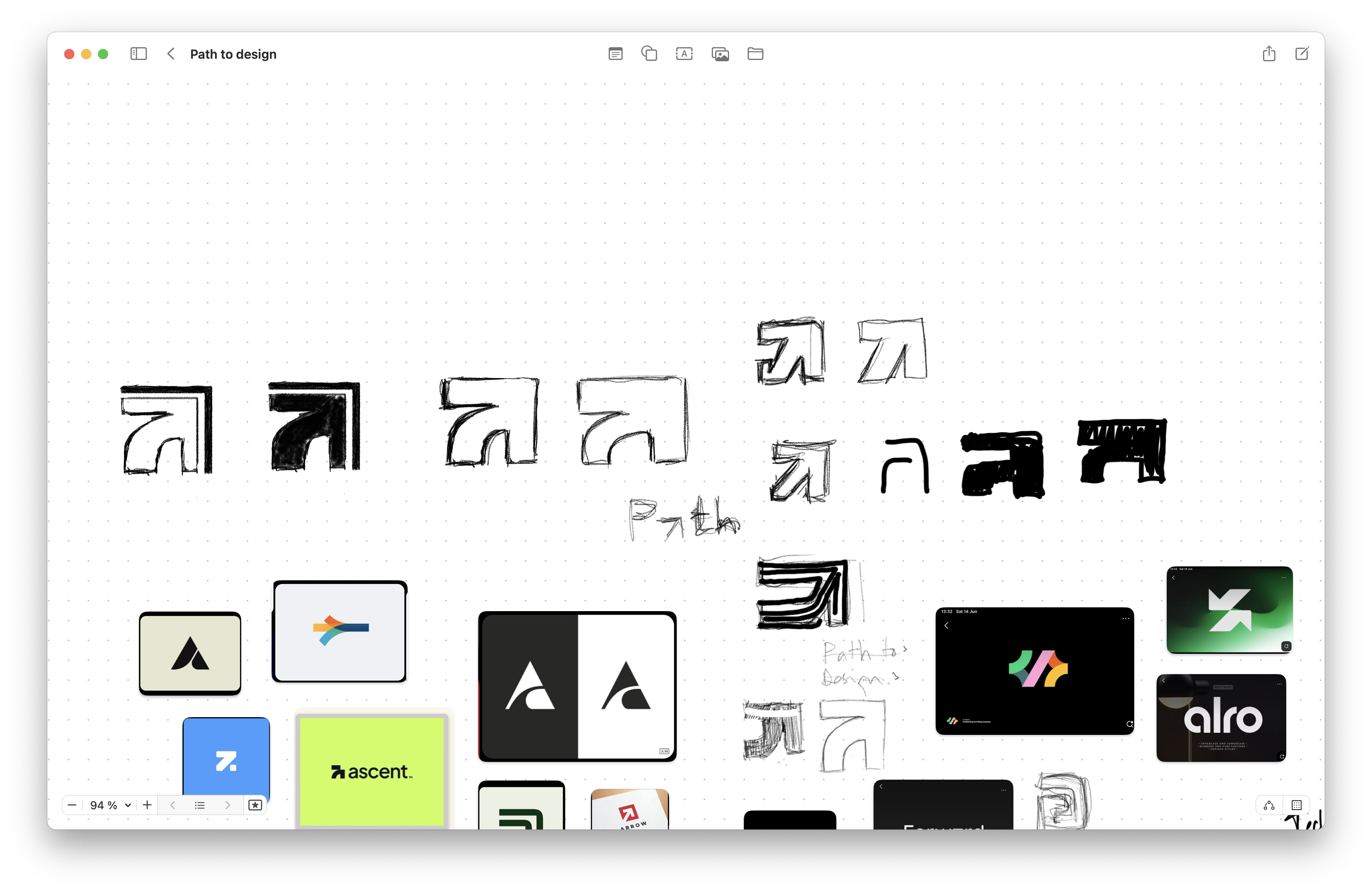
Since I wanted to create a memorable brand, I knew it was important to develop a stronger logo. As with all of my logo design projects, I sketched out multiple concepts based on keywords that described the brand, such as path, tech, and tools.
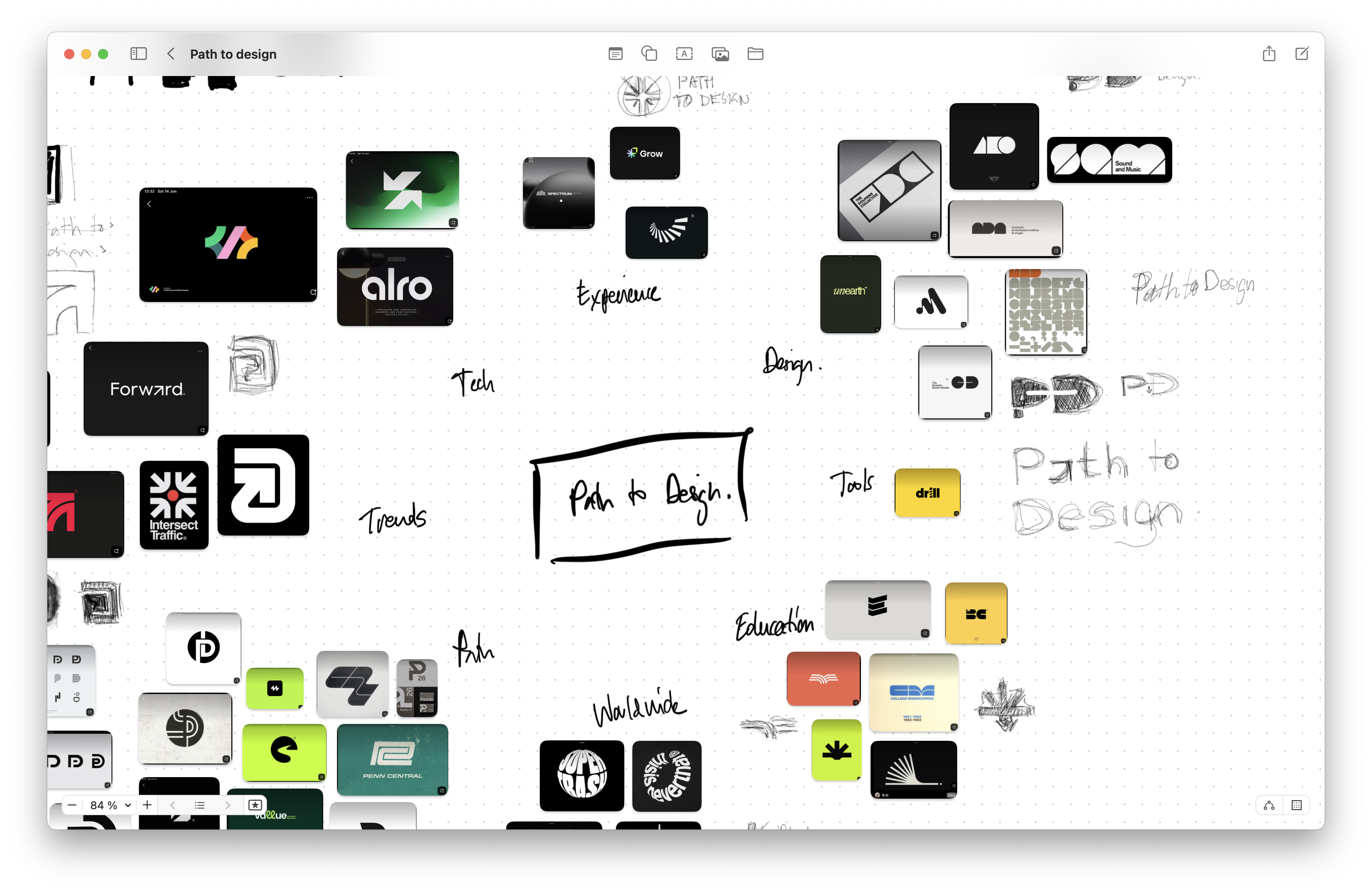
I was drawn to the idea of an arrow resembling the letter “a” in the logo and spent time iterating on this concept. After a few refinements, I settled on a design and color palette that gave the brand a stronger identity.
Using the latest framework
Since I had redesigned the logo, it was important for the rest of the site to follow. I updated several components to reflect the new brand direction.
Shadcn/ui is a new frontend framework that has become very popular in the developer community. I wanted to incorporate it into the tech stack to better understand how it worked, so I updated all the necessary components using Shadcn/ui.
Overall thoughts
I am pleased with the latest look and feel of the site. I feel more confident approaching designers with a brand that looks more professional.
![]()
Perhaps in a few years I will think another redesign is in order, but for now I am happy with the outcome.